Last updated on August 20, 2023
Welcome to the first in a series of posts called “Inside the Compendium” where I dive into the XML compendium for Fight Club 5, Game Master 5, and EncounterPlus. In this post I will be explaining my general styles & conventions. Before I dive into the particulars fo the different types of objects, I want to take a moment and briefly explain my basic do’s and don’ts for formatting the XML files.
For those of you who remember my post and video Primer on XML and the Fight Club Compendium, this blog post is a much overdue update.
Organization
My approach to organizing the compendium files is simple. I use comments to separate objects by source type, source, object type, and object. I know most users are not proficient with advanced text editors and regular expressions, so I organize them like this to give non-technical users a chance, Readability and the ability to remove sources easily is key. To accomplish this, all of my files are organized as follows:
<!-- Core Sourcebooks -->
    <!-- System Reference Document 5.1 -->
        <!-- Backgrounds  -->
            <!-- Acolyte -->
                <background>
                    ...
                </background>
    <!-- Elemental Evil Player's Companion -->
        ...
    <!-- The Tortle Package -->
        ...
<!-- Adventures -->
    <!-- Wild Sheep Chase -->
        ...
<!-- Unearthed Arcana -->
    <!-- Centaurs and Minotaurs -->
        ...
<!-- Homebrew -->
    <!-- MrFarland's Exotic Arms and Armor -->
        ...
One of the added benefits of this approach is the ability to “fold” lines based on the comments. While not all text editors are created equal, Sublime Text, which I use on both Mac and Windows does this well. With the click of a few buttons, I can quickly change the view of that file from what you see above to:
<!-- Core Sourcebooks -->
    <!-- System Reference Document 5.1 -->
    <!-- Elemental Evil Player's Companion -->
<!-- Adventures -->
<!-- Unearthed Arcana -->
<!-- Homebrew -->
    <!-- MrFarland's Exotic Arms and Armor -->
        ...
Text Formatting
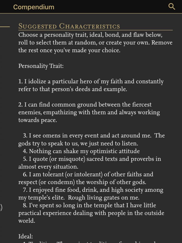
One of the most common issues I run across in the legacy compendium files is the formatting. A lot of the entries in the files were made by different people with very different ideas on how the various text blocks should be formatted. Over time, I’ve managed to clean a number of them up, but I still have tens of thousands of objects to go through.
The following are just a few styles and conventions that I follow in the maintenance of my own personal compendium.
Line Spacing
The <text></text> tags do not function like proper paragraphs. There is no whitespace before or after the block and multiple paragraphs run together and make them difficult to read.
Do This
<text>Lorem ipsum dolor sit amet consectetur adipiscing elit, sed do tempor.</text>
<text/>
<text>Lorem ipsum dolor sit amet consectetur adipiscing elit, sed do tempor.</text>
<text/>
Always put a “<text/>” tag after a block of text to add whitespace and improve readability.
Don’t Do This
<text>Lorem ipsum dolor sit amet consectetur adipiscing elit, sed do tempor.</text>
<text>Lorem ipsum dolor sit amet consectetur adipiscing elit, sed do tempor.</text>
Don’t let paragraphs run together and make these blocks hard to read.
Indentation
Do not indent text inside the text blocks. Always start against the opening <text> tag.
Do This
<text>Lorem ipsum dolor sit amet consectetur elit, sed do tempor.</text>
<text/>
Start the text right against the opening tag.
Don’t Do This
<text>    Lorem ipsum dolor sit amet consectetur elit, sed do tempor.</text>
<text/>
Do not add spaces or tabs to indent.
Lists (Numbered)
Ensure the above rules are observed and start each line with <#>. and two spaces.
Do This
<text>1.  Lorem ipsum dolor sit amet consectetur elit, sed do tempor.</text>
<text/>
<text>2.  Lorem ipsum dolor sit amet consectetur elit, sed do tempor.</text>
<text/>
Adding a blank line between list items and not indenting helps reduce line wrapping and easier to read when it can’t be avoided .
Don’t Do This
<text>1)  Lorem ipsum dolor sit amet consectetur elit, sed do tempor.</text>
or
<text>   1. Lorem ipsum dolor sit amet consectetur elit, sed do tempor.</text>
or
<text>1.  Lorem ipsum dolor sit amet consectetur elit, sed do tempor.</text>
<text>2.  Lorem ipsum dolor sit amet consectetur elit, sed do tempor.</text>
Lists (Bulleted)
Always use the HTML code for bullets (•).
Do This
<text>• Lorem ipsum dolor sit amet consectetur elit, sed do tempor.</text>
<text/>
<text>• Lorem ipsum dolor sit amet consectetur elit, sed do tempor.</text>
<text/>The HTML code • will always be replaced with a round bullet regardless of the user’s device, language, character set, etc.
Don’t Do This
<text>• Lorem ipsum dolor sit amet consectetur elit, sed do tempor.</text>
<text/>
<text>• Lorem ipsum dolor sit amet consectetur elit, sed do tempor.</text>
<text/>While unlikely, it is possible the ‘•’ can be replaced or displayed differently from one device to the next. The HTML code is standard.
Living Document
While my original primer video is still very helpful, a lot has changed since I created that video. I’ve learned a lot, the application has evolved as have I. I do things differently today than I did then AND I’ve had the opportunity to work with and learn from all of you. Long story short, I will update this “styles & conventions” document as new techniques and ideas come about.
